Saving researchers hours with intuitive data analysis
The Market Research Dynamic Data Analysis Dashboard surfaces insights and gives researchers controls with detailed configurations and stylization of data visualizations.
Lead UI/UX Designer
UX Researcher
Role
Jan – Apr 2022
(4 months)
Timeline
Figma
Tools
Lead Designer
Engineering
Product Manager
Team
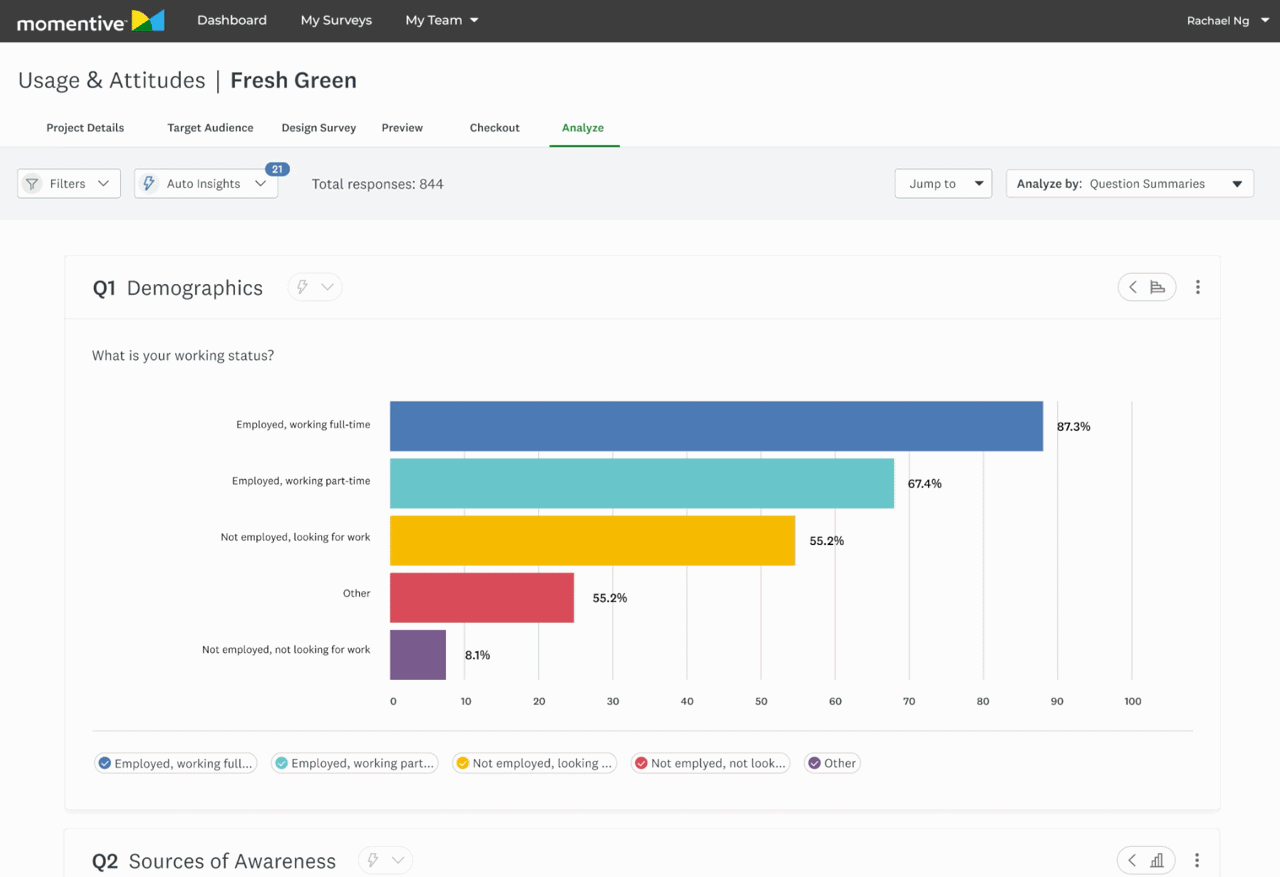
Overview
The aim of this feature was to launch an MVP that enabled Market Researchers to effectively analyze and customize the presentation of data collected from their survey.
I was the lead designer of the Usage & Attitudes product, which existed within the Market Research pillar of the company. It was targeted at researchers wanting to explore how consumers use a product or service and their attitudes toward it.
Impact

Improved user sentiment
Researchers reported a more intuitive experience when exploring data.

Helped shape AI insights
Now a core feature in SurveyMonkey’s product offerings.

Aligned design org
Systems work equipped designers in broader company to address inconsistencies in suite.

At a Glance
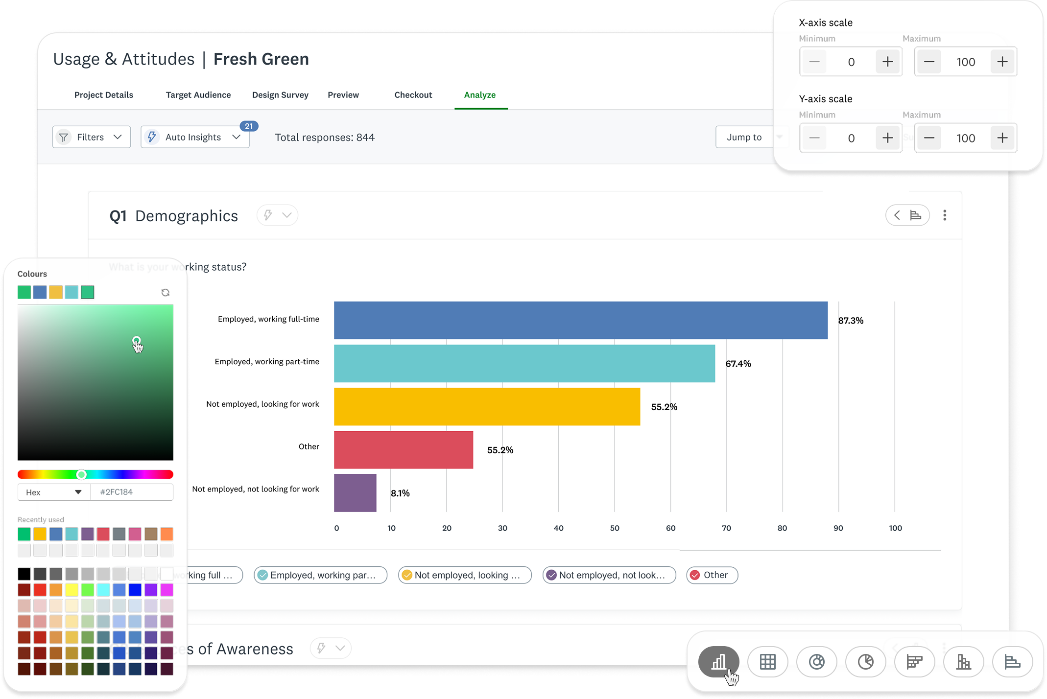
A powerful data dashboard that surfaces key insights while giving researchers control.
Image
Data Dashboard UI
Image
Core Component Catalogue
Image
Chart Type Showcase
Context
An opportunity to shape a product in it’s infancy.
SurveyMonkey’s Usage and Attitudes product was still fresh-faced at the time. This was a chance to learn from more mature verticals within Market Research, and improve our data visualization patterns. We wanted to use this as a chance to improve Market Research data visualization patterns as a whole.
The Problem
This wasn’t a straight-forward optimization, there were constraints from the get-go.

Limited UI freedom
Required to balance the established Core team’s design system and Market Research’s distinct style.

New patterns must be scalable
Components had to be scalable across a large product ecosystem, spanning outside Market Research.

Building a MVP
We made tradeoffs to ensure customers gained access to value sooner.
The Challenge
Optimize an experience that distills complex datasets into intuitive data visualizations, and enables user customization.
Goals
Design new chart offerings and iterate upon existing ones
Increase legibility and ease of use
Makeover the customization experience
Auto visualize data effectively, but give researchers options to iterate further for their needs.
Competitive Analysis
Identifying the industry standard


Robust filtering and segmentation options
Strong support for complex datasets

Overwhelming UI with steep learning curve
Limited visual polish in default charts

Clean, lightweight charts with good readability
Strong emphasis on simplicity and ease of use
Limited customization options
Not well-suited for advanced researchers needing deep insights
User Research
Uncovering user values
I interviewed our research team and a data visualization designer on the Core pillar of the company to understand what our users were looking for. Conversations with research covered customization settings, entry points, and interactions. Consulting with the Core team’s designer aided my expansion in understanding best practice for data legibility.
Highlighted insights
Less searching for patterns = time saved

Visual Digestion
Clear data visualization for less cognitive load

Control over format
Configure data to help uncover more
Secondary Research
Defining data visualization best practices
I conducted secondary research to better understand data visualization best practices. This included when to use certain chart types, how to best portray complex data in tables, and data table best practices.
Do’s
Use the right chart type
Keep visuals uncluttered
Maintain consistency in metrics, colors, and styles
Provide context for clarity
Ensure accessibility
Don’ts
3D effects
Excessive colors
Inconsistent metrics, colors, and styling
Omitting context or manipulating data
Information overload
Constraints
Finding workarounds amidst the chaos
Interviewing cross-pillar designers in SurveyMonkey ensured new patterns fit the Market Research style while being scalable across products.
Interviewing cross-pillar designers in SurveyMonkey ensured new patterns fit the Market Research style while being scalable across products.
Align new components with Core SurveyMonkey Design System, while being distinguished for Market Research pillar.
New components must be scalable across entire SurveyMonkey product suite.
MVP was kept in mind throughout the design process, with constant communication and feedback with Engineering and Product.
Technical resource limits
Setting KPI’s
Laying a foundation to measure success post launch

Metric 1.
# of clicks in customization side panel
Less clicks = user reached goal sooner

Metric 2.
# of chart type changes in analysis dashboard
Less clicks = initial chart did the job

Metric 3.
Qualitative sentiment from researchers
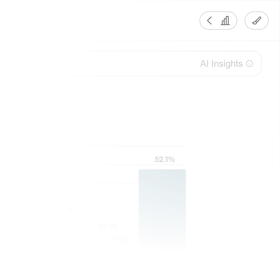
AI Insights
Using AI to surface insights on a silver platter
Our users were clear: they wanted to get to the good stuff faster. I designed AI Insights in response, but conversation with Product and Engineering revealed that we didn’t have the resources for it. The business decision was made to surface this with a disabled button, we knew this was on the roadmap. This is the conversation that revealed that we were creating an MVP.
We wanted AI insights, but it was out of scope. My work here helped lay the foundation for the future of AI insights, now a core feature within SurveyMonkey.
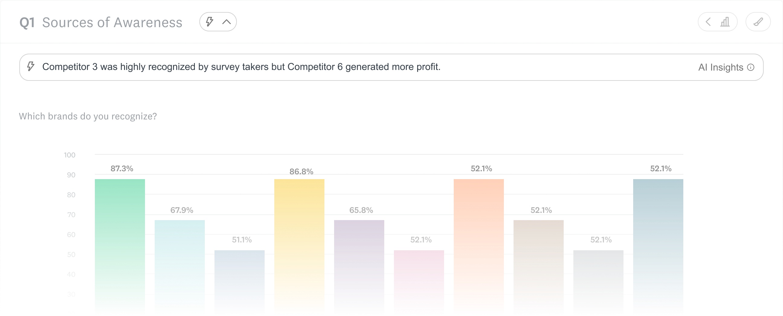
Image
AI insight exploration

Designing new and old charts
Expanding the business offerings while improving existing ones
Market Research had some of the same chart offerings that the core SurveyMonkey product had, but not all. I was tasked with updating the offerings and improving upon them. Although the work happened within the Market Research pillar, this initiative would influence data visualization across the company.
OLD - Core product
Image
Bar graph in the core Surveymonkey experience
NEW - Market Research product
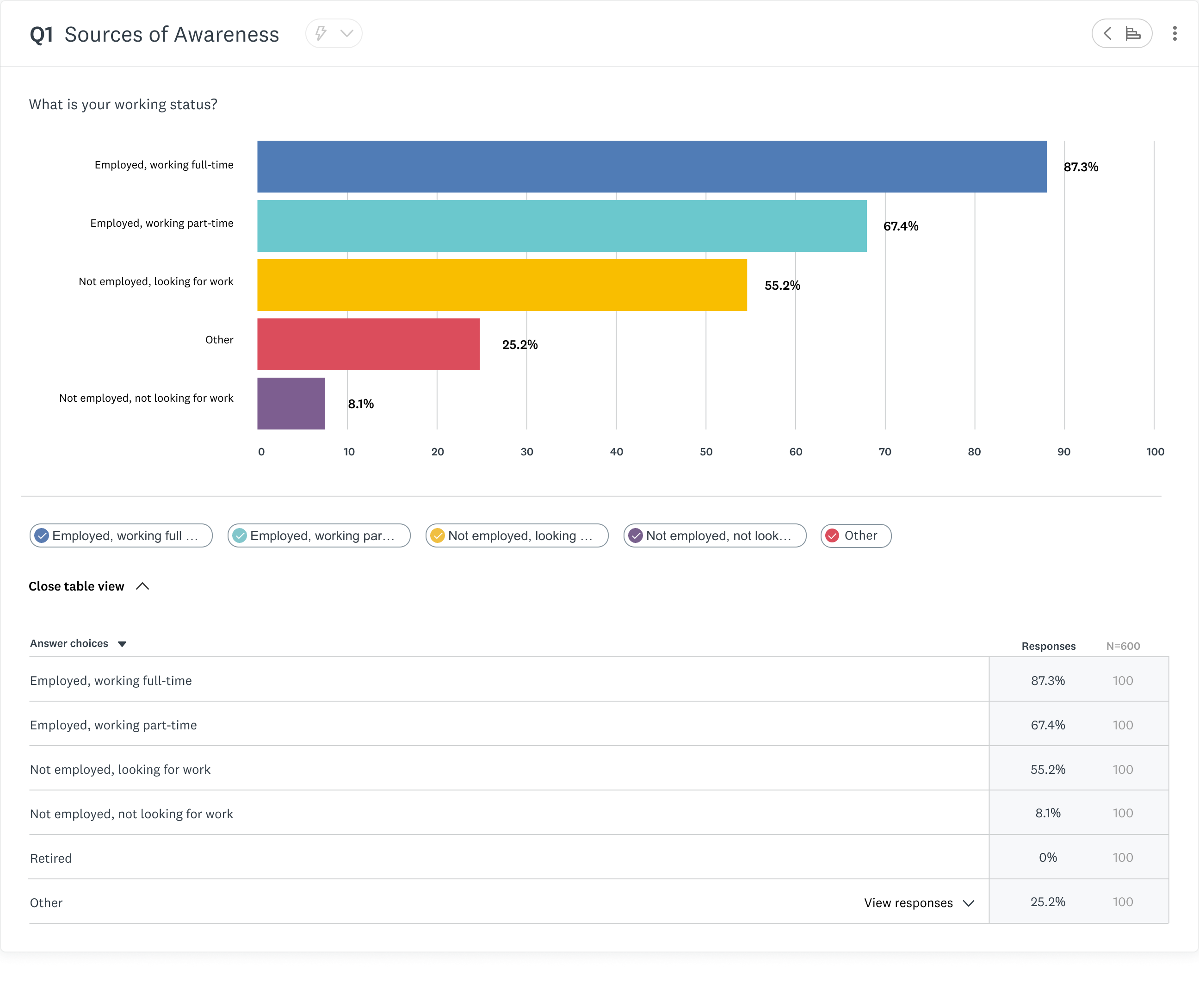
Image
Bar graph in the market research SurveyMonkey experience
Designing with complexity
How do you design charts that are flexible enough to serve 1000’s of use cases, yet intuitive to an audience with diverse tech literacy?
I created new chart offerings within Market Research, informed by the foundations laid by the Core team, improved for the Market Research audience. Charts went through countless iterations informed by data and user feedback.
Information Architecture
Surfacing high touchpoints
I made changes to information architecture within the chart modules to surface high traffic actions.
Market Researchers said they wanted to change chart types faster in interviews, so I surfaced it.
Before
4 clicks

Click “...” button

Select customize
Tab to chart type page
Change chart
After
1 click
Hover over chart chip
Change chart

GIF
Changing Chart Types
Image
Exploring compatible chart visualizations
Building for scalability
We decided to introduce a “more” button, nesting the lower-traffic customization button. Data showed researchers weren’t customizing charts as often as anticipated, and we had more functionality lined up on the roadmap.
Image
Before

Image
After
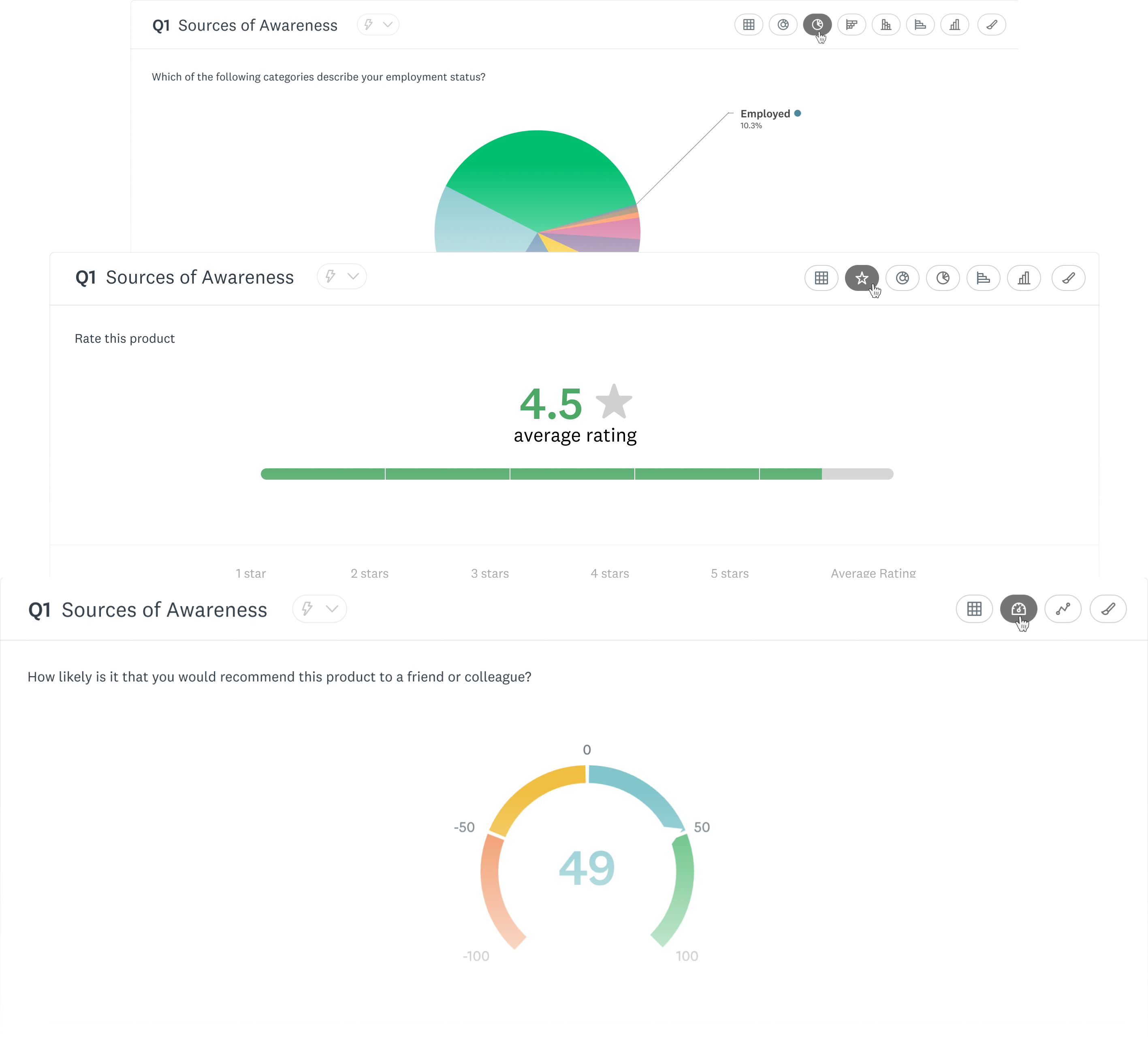
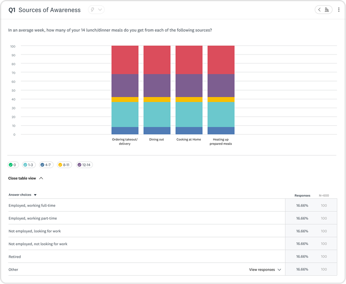
Organizing data for flexible use cases
Tables come in many shapes and sizes, I bounced ideas off fellow data visualization designers, and researchers to determine how tables would show up for users.
Image
Matrix Table
Image
Matrix Table with annotations
Image
Scale Chart with table
Image
Word cloud graph
Image
Pie Chart graph
Image
NPS graph
Image
Scale graph
Image
Horizontal Bar Graph
Image
Single Row Stacked Horizontal Bar Graph
Image
Multiple Row Stacked Horizontal Bar Graph
Image
Vertical Bar Graph
Image
Single Column Stacked Vertical Bar Graph
Image
Multiple Column Stacked Vertical Bar Graph


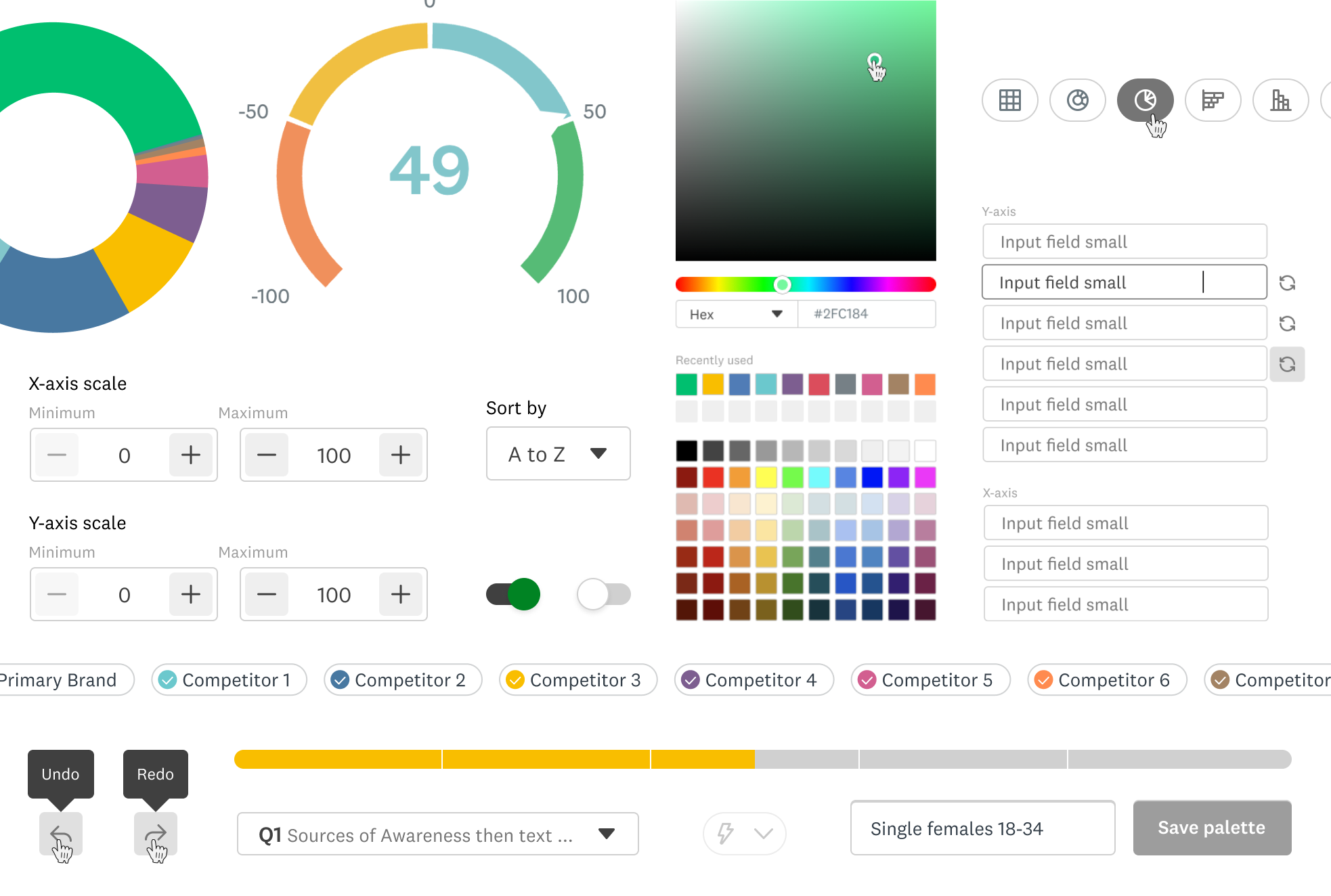
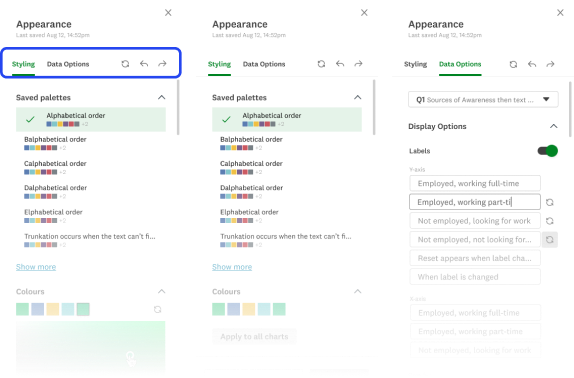
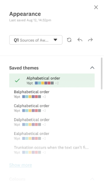
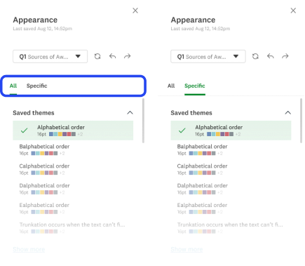
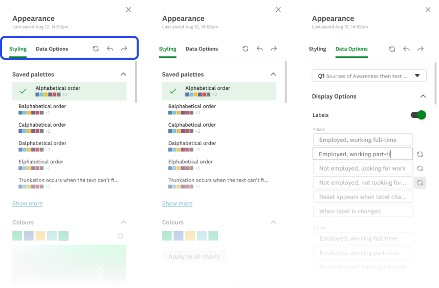
Customization
Giving users power and control over their data
Part of this work included improving ways for users to configure and style their charts. I constantly went back and forth with the Design Systems and Market Research team for feedback. I let the data guide my decisions. This is also when I introduced WCAG-compliant color recommendations to improve accessibility.
1
Broke from the established old UX patterns for enhanced usability
We internally determined to stray from the core SurveyMonkey experience, where customization settings were nested within each chart. Market researchers handle large amounts of data, and having to click into each module would take too long. To streamline their workflow, we surfaced customization up a layer, deciding on a side panel approach.
Image
Customization in the core SurveyMonkey experience
2
Giving users the chance to become experts in our interface
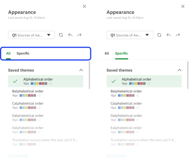
My first exploration (v1) had no tabs, rather users would scroll to the section they wanted to configure. I decided this had the chance to grow too long, and scrapped the idea. The next exploration introduced the idea of dynamic tabbing - information in the side panel would configure itself depending on the chart selected.
We initially thought dynamic tabbing (2) would streamline researcher workflows, but user testing showed the opposite, so we pivoted to set tabbing (3).

Image
- No Tabs
Image
- Dynamic Tabbing
Image
- Set Tabs
Product
Powerful features, intuitive interface.

1
An expansive library of data visualizations to give users control.
GIF
Changing Chart Types
2
Impress everyone in the board room with on-brand styling
GIF
Styling Charts
Next steps
Defining where we go from here
This product went live after saying my goodbye’s at SurveyMonkey. Before moving onto the next, I outlined clear next steps to continue refining the experience.
My focus would have been on conducting usability testing to evaluate the customization panel, data organization, and overall legibility. These insights would have informed further iterations to improve researcher satisfaction and ensure the analyze features were both intuitive and powerful.
User Testing

Iteration
Product Launch
Design QA
Gauge Success via KPI’s
|
Key Takeaways
Collaboration is essential
Working with Design Systems and cross-functional partners helped align on scalable, sustainable solutions.
Constraints drive focus
While ML insights were exciting, focusing on an MVP ensured the project remained feasible.
Scalability is key
Designing for a large product ecosystem requires balancing innovation with established patterns.
Thanks for scrolling! Want to see more?
Dynamic Livestream Templates Rally Cry

Let’s connect
We could be good together.


rachael.sun.ng@gmail.com


© 2026 Rachael Ng
Saving researchers hours with intuitive data analysis
The Market Research Dynamic Data Analysis Dashboard surfaces insights and gives researchers controls with detailed configurations and stylization of data visualizations.
Lead UI/UX Designer
UX Researcher
Role
Jan – Apr 2022
(4 months)
Timeline
Figma
Tools
Lead Designer
Engineering
Product Manager
Team
Overview
The aim of this feature was to launch an MVP that enabled Market Researchers to effectively analyze and customize the presentation of data collected from their survey.
I was the lead designer of the Usage & Attitudes product, which existed within the Market Research pillar of the company. It was targeted at researchers wanting to explore how consumers use a product or service and their attitudes toward it.
Impact
Improved user sentiment
Researchers reported a more intuitive experience when exploring data.
Helped shape AI insights
Now a core feature in SurveyMonkey’s product offerings.
Aligned design org
Systems work equipped designers in broader company to address inconsistencies in suite.

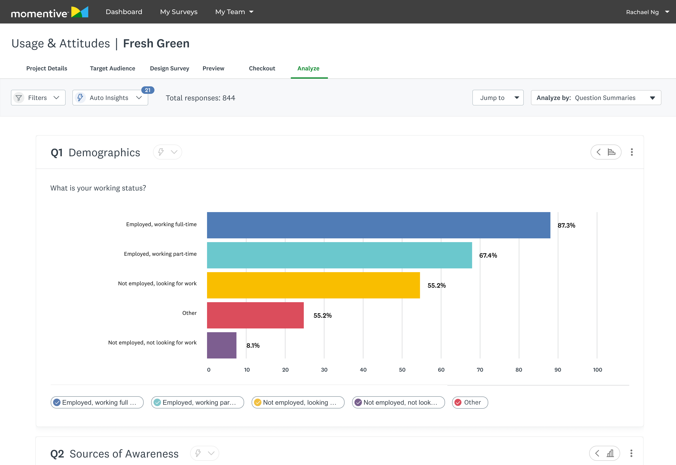
At a Glance
A powerful data dashboard that surfaces key insights while giving researchers control.
Image
Data Dashboard UI
Image
Core Component Catalogue
Image
Chart Type Showcase
Context
An opportunity to shape a product in it’s infancy.
SurveyMonkey’s Usage and Attitudes product was still fresh-faced at the time. This was a chance to learn from more mature verticals within Market Research, and improve our data visualization patterns. We wanted to use this as a chance to improve Market Research data visualization patterns as a whole.
The Problem
This wasn’t a straight-forward optimization, there were constraints from the get-go.
Limited UI freedom
Required to balance the established Core team’s design system and Market Research’s distinct style.
New patterns must be scalable
Components had to be scalable across a large product ecosystem, spanning outside Market Research.
Building a MVP
We made tradeoffs to ensure customers gained access to value sooner.
The Challenge
Optimize an experience that distills complex datasets into intuitive data visualizations, and enables user customization.
Goals
Design new chart offerings and iterate upon existing ones
Increase legibility and ease of use
Makeover the customization experience
Auto visualize data effectively, but give researchers options to iterate further for their needs.
Competitive Analysis
Identifying the industry standard

Robust filtering and segmentation options
Strong support for complex datasets
Overwhelming UI with steep learning curve
Limited visual polish in default charts
Clean, lightweight charts with good readability
Strong emphasis on simplicity and ease of use
Limited customization options
Not well-suited for advanced researchers needing deep insights
User Research
Uncovering user values
I interviewed our research team and a data visualization designer on the Core pillar of the company to understand what our users were looking for. Conversations with research covered customization settings, entry points, and interactions. Consulting with the Core team’s designer aided my expansion in understanding best practice for data legibility.
Highlighted insights
Less searching for patterns = time saved
Visual Digestion
Clear data visualization for less cognitive load
Control over format
Configure data to help uncover more
Secondary Research
Defining data visualization best practices
I conducted secondary research to better understand data visualization best practices. This included when to use certain chart types, how to best portray complex data in tables, and data table best practices.
Do’s
Use the right chart type
Keep visuals uncluttered
Maintain consistency in metrics, colors, and styles
Provide context for clarity
Ensure accessibility
Don’ts
3D effects
Excessive colors
Inconsistent metrics, colors, and styling
Omitting context or manipulating data
Information overload
Constraints
Finding workarounds amidst the chaos
Must align new components with Core SurveyMonkey Design System, while being distinguished for Market Research pillar.

Worked closely with the lead designer of the Design Systems team. All new components followed company-wide UX patterns.
Collaborating with other designers in the Market Research team ensured new patterns fit the Market Research style while being scalable across products.
New components must be scalable across entire SurveyMonkey product suite.
Interviewing cross-pillar designers in SurveyMonkey ensured new patterns fit the Market Research style while being scalable across products.
Technical resource limits
MVP was kept in mind throughout the design process, with constant communication and feedback with Engineering and Product.
Setting KPI’s
Laying a foundation to measure success post launch
Metric 1.
# of clicks in customization side panel
Less clicks = user reached goal sooner
Metric 2.
# of chart type changes in analysis dashboard
Less clicks = initial chart did the job
Metric 3.
Qualitative sentiment from researchers
AI Insights
Using AI to surface insights on a silver platter
Our users were clear: they wanted to get to the good stuff faster. I designed AI Insights in response, but conversation with Product and Engineering revealed that we didn’t have the resources for it. The business decision was made to surface this with a disabled button, we knew this was on the roadmap. This is the conversation that revealed that we were creating an MVP.
We wanted AI insights, but it was out of scope. My work here helped lay the foundation for the future of AI insights, now a core feature within SurveyMonkey.
Image
AI insight exploration

Designing new and old charts
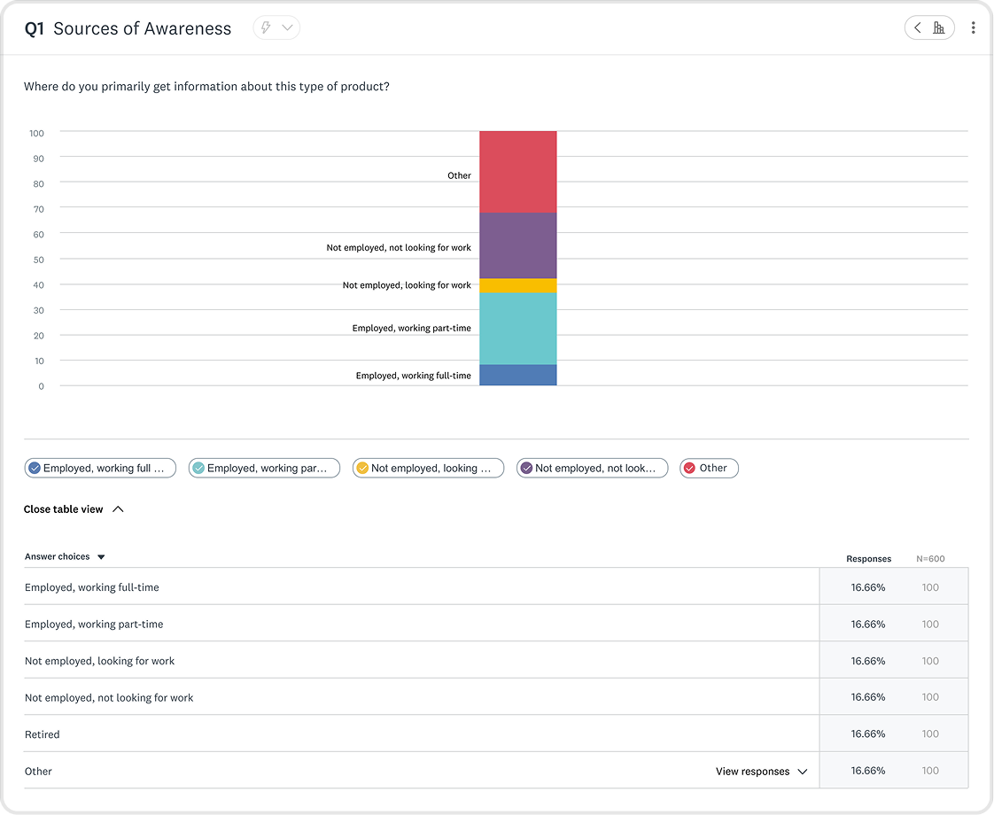
Expanding the business offerings while improving existing ones
Market Research had some of the same chart offerings that the core SurveyMonkey product had, but not all. I was tasked with updating the offerings and improving upon them. Although the work happened within the Market Research pillar, this initiative would influence data visualization across the company.
OLD - Core product
Image
Bar graph in the core Surveymonkey experience
NEW - Market Research product
Image
Bar graph in the market research SurveyMonkey experience
Designing with complexity
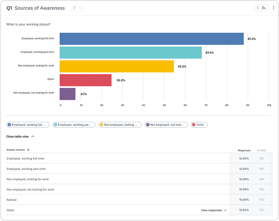
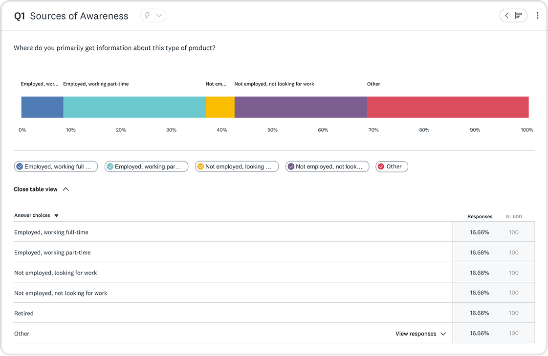
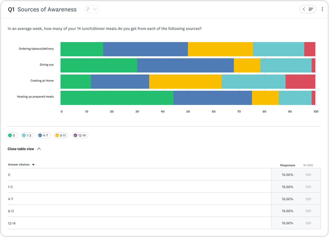
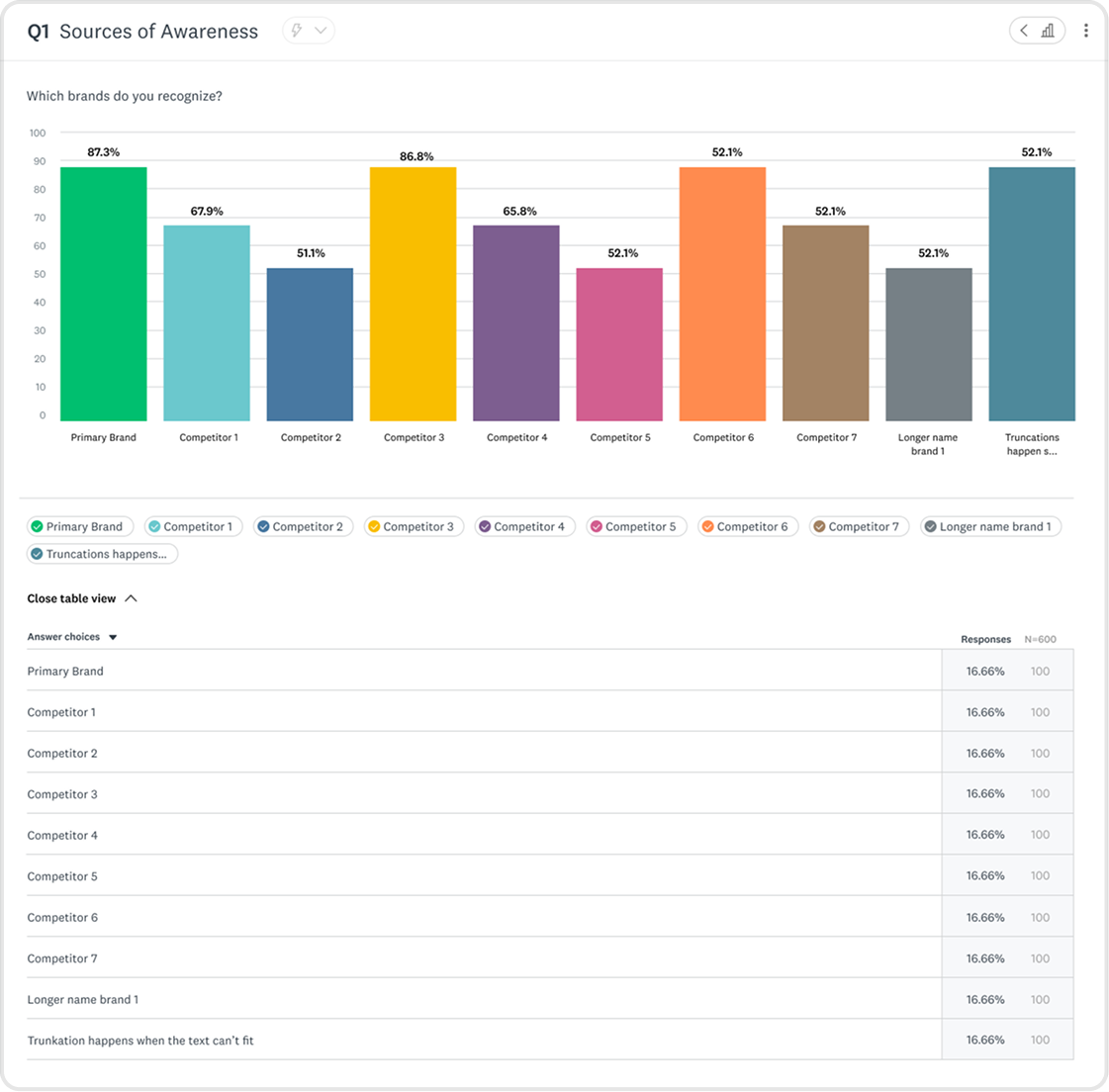
How do you design charts that are flexible enough to serve 1000’s of use cases, yet intuitive to an audience with diverse tech literacy?
I created new chart offerings within Market Research, informed by the foundations laid by the Core team, improved for the Market Research audience. Charts went through countless iterations informed by data and user feedback.
Information Architecture
Surfacing high touchpoints
I made changes to information architecture within the chart modules to surface high traffic actions.
Market Researchers said they wanted to change chart types faster in interviews, so I surfaced it.
Before
4 clicks

Click “...” button

Select customize
Tab to chart type page
Change chart
After
1 click
Hover over chart chip
Change chart
GIF
Changing Chart Types
Chart Changer States
Default


Hover


Default
Hover


Pressed
Active


Image
Chart Changer Style Guide
Image
Exploring compatible chart visualizations
Building for scalability
We decided to introduce a “more” button, nesting the lower-traffic customization button. Data showed researchers weren’t customizing charts as often as anticipated, and we had more functionality lined up on the roadmap.
Image
Before
Image
After
Organizing data for flexible use cases
Tables come in many shapes and sizes, I bounced ideas off fellow data visualization designers, and researchers to determine how tables would show up for users.
Image
Matrix Table
Image
Matrix Table with annotations
Image
Scale Chart with table
Image
Word cloud graph
Image
Pie Chart graph
Image
NPS graph
Image
Scale graph
Image
Horizontal Bar Graph
Image
Single Row Stacked Horizontal Bar Graph
Image
Multiple Row Stacked Horizontal Bar Graph
Image
Vertical Bar Graph
Image
Single Column Stacked Vertical Bar Graph
Image
Multiple Column Stacked Vertical Bar Graph


Customization
Giving users power and control over their data
Part of this work included improving ways for users to configure and style their charts. I constantly went back and forth with the Design Systems and Market Research team for feedback. I let the data guide my decisions. This is also when I introduced WCAG-compliant color recommendations to improve accessibility.
1
Broke from the established old UX patterns for enhanced usability
We internally determined to stray from the core SurveyMonkey experience, where customization settings were nested within each chart. Market researchers handle large amounts of data, and having to click into each module would take too long. To streamline their workflow, we surfaced customization up a layer, deciding on a side panel approach.
Image
Customization in the core SurveyMonkey experience
2
Giving users the chance to become experts in our interface
My first exploration (v1) had no tabs, rather users would scroll to the section they wanted to configure. I decided this had the chance to grow too long, and scrapped the idea. The next exploration introduced the idea of dynamic tabbing - information in the side panel would configure itself depending on the chart selected.
We initially thought dynamic tabbing (2) would streamline researcher workflows, but user testing showed the opposite, so we pivoted to set tabbing (3).
Image
- No Tabs
Image
- Dynamic Tabbing
Image
- Set Tabs
Product
Powerful features, intuitive interface.
1
An expansive library of data visualizations to give users control.
GIF
Changing Chart Types
2
Impress everyone in the board room with on-brand styling
GIF
Styling Charts
Next steps
Defining where we go from here
This product went live after saying my goodbye’s at SurveyMonkey. Before moving onto the next, I outlined clear next steps to continue refining the experience.
My focus would have been on conducting usability testing to evaluate the customization panel, data organization, and overall legibility. These insights would have informed further iterations to improve researcher satisfaction and ensure the analyze features were both intuitive and powerful.
Usability:
Customization panel
Data Organization
General sentiment
User Testing

Iteration

Product Launch
Design QA

Gauge Success via KPI’s
|
Key Takeaways
Collaboration is essential
Working with Design Systems and cross-functional partners helped align on scalable, sustainable solutions.
Constraints drive focus
While ML insights were exciting, focusing on an MVP ensured the project remained feasible.
Scalability is key
Designing for a large product ecosystem requires balancing innovation with established patterns.
Thanks for scrolling! Want to see more?
Let’s connect
We could be good together.
rachael.sun.ng@gmail.com

© 2026 Rachael Ng
Saving researchers hours with intuitive data analysis
The Market Research Dynamic Data Analysis Dashboard surfaces insights and gives researchers controls with detailed configurations and stylization of data visualizations.
Lead UI/UX Designer
UX Researcher
Role
Jan – Apr 2022
(4 months)
Timeline
Figma
Tools
Lead Designer
Engineering
Product Manager
Team
Overview
The aim of this feature was to launch an MVP that enabled Market Researchers to effectively analyze and customize the presentation of data collected from their survey.
I was the lead designer of the Usage & Attitudes product, which existed within the Market Research pillar of the company. It was targeted at researchers wanting to explore how consumers use a product or service and their attitudes toward it.
Impact
Improved user sentiment
Researchers reported a more intuitive experience when exploring data.
Helped shape AI insights
Now a core feature in SurveyMonkey’s product offerings.
Aligned design org
Systems work equipped designers in broader company to address inconsistencies in suite.
At a Glance
A powerful data dashboard that surfaces key insights while giving researchers control.
Image
Data Dashboard UI
Image
Core Component Catalogue
Image
Chart Type Showcase
Context
An opportunity to shape a product in it’s infancy.
SurveyMonkey’s Usage and Attitudes product was still fresh-faced at the time. This was a chance to learn from more mature verticals within Market Research, and improve our data visualization patterns. We wanted to use this as a chance to improve Market Research data visualization patterns as a whole.
The Problem
This wasn’t a straight-forward optimization, there were constraints from the get-go.
Limited UI freedom
Required to balance the established Core team’s design system and Market Research’s distinct style.
New patterns must be scalable
Components had to be scalable across a large product ecosystem, spanning outside Market Research.
Building a MVP
We made tradeoffs to ensure customers gained access to value sooner.
The Challenge
Optimize an experience that distills complex datasets into intuitive data visualizations, and enables user customization.
Goals
Design new chart offerings and iterate upon existing ones
Increase legibility and ease of use
Makeover the customization experience
Auto visualize data effectively, but give researchers options to iterate further for their needs.
|
Process
1
2
3
4
5
6
7
8
9
10
11
12
13
14
15
16

Research
Synthesize context, and conduct user, secondary, and competitive research.

Rapid ideation & prototyping
Flows, content, structure.

Design iteration & validation
Information architecture, data table content design, and user interviews.

Hand-off
Style guide, and engineering call for clarification.

Review
Design systems, engineering, product, and cross-pillar design feedback sessions.
Competitive Analysis
Identifying the industry standard

Robust filtering and segmentation options
Strong support for complex datasets
Overwhelming UI with steep learning curve
Limited visual polish in default charts
Clean, lightweight charts with good readability
Strong emphasis on simplicity and ease of use
Limited customization options
Not well-suited for advanced researchers needing deep insights
User Research
Uncovering user values
I interviewed our research team and a data visualization designer on the Core pillar of the company to understand what our users were looking for. Conversations with research covered customization settings, entry points, and interactions. Consulting with the Core team’s designer aided my expansion in understanding best practice for data legibility.
Highlighted insights
Less searching for patterns = time saved
Visual Digestion
Clear data visualization for less cognitive load
Control over format
Configure data to help uncover more
Secondary Research
Defining data visualization best practices
I conducted secondary research to better understand data visualization best practices. This included when to use certain chart types, how to best portray complex data in tables, and data table best practices.
Do’s
Use the right chart type
Keep visuals uncluttered
Maintain consistency in metrics, colors, and styles
Provide context for clarity
Ensure accessibility
Don’ts
3D effects
Excessive colors
Inconsistent metrics, colors, and styling
Omitting context or manipulating data
Information overload
Constraints
Finding workarounds amidst the chaos
Constraint

Align new components with Core SurveyMonkey Design System, while being distinguished for Market Research pillar.
Solution
Worked closely with the lead designer of the Design Systems team. All new components followed company-wide UX patterns.
Collaborating with other designers in the Market Research team ensured new patterns fit the Market Research style while being scalable across products.
New components must be scalable across entire SurveyMonkey product suite.
Interviewing cross-pillar designers in SurveyMonkey ensured new patterns fit the Market Research style while being scalable across products.
Technical resource limits
MVP was kept in mind throughout the design process, with constant communication and feedback with Engineering and Product.
Setting KPI’s
Laying a foundation to measure success post launch
Metric 1.
# of clicks in customization side panel
Less clicks = user reached goal sooner
Metric 2.
# of chart type changes in analysis dashboard
Less clicks = initial chart did the job
Metric 3.
Qualitative sentiment from researchers
Designing new and old charts
Expanding the business offerings while improving existing ones
Market Research had some of the same chart offerings that the core SurveyMonkey product had, but not all. I was tasked with updating the offerings and improving upon them. Although the work happened within the Market Research pillar, this initiative would influence data visualization across the company.
OLD - Core product
Image
Bar graph in the core Surveymonkey experience
NEW - Market Research product
Image
Bar graph in the market research SurveyMonkey experience
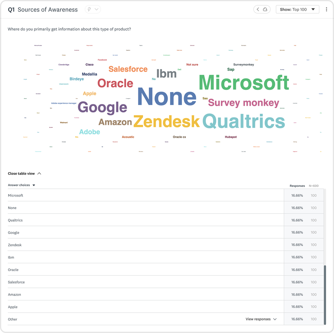
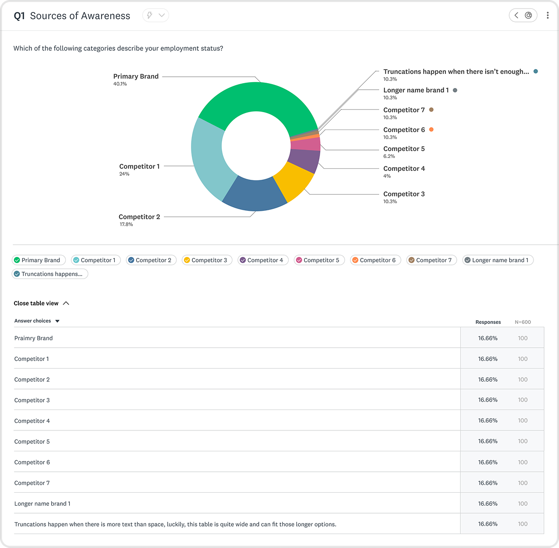
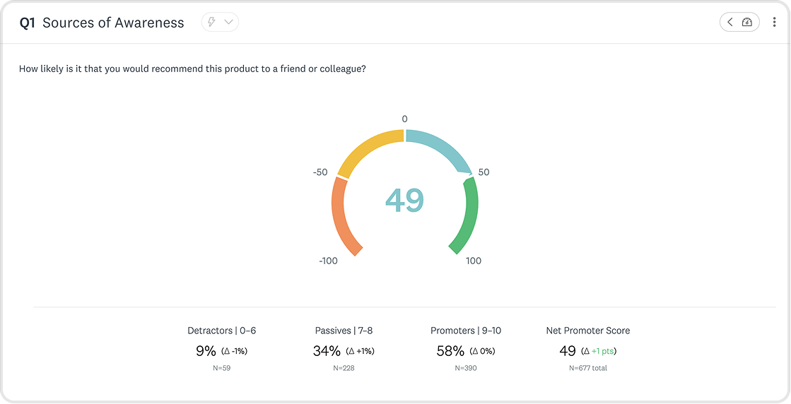
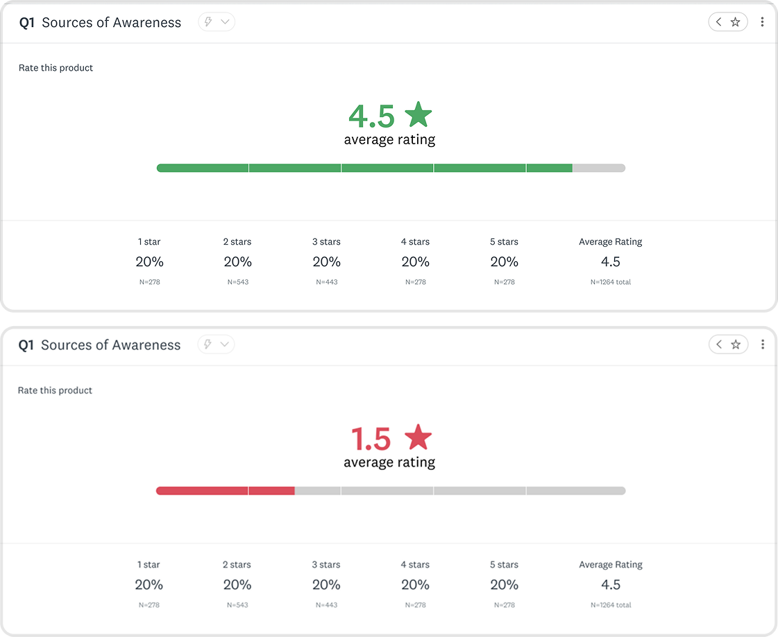
Designing with complexity
How do you design charts that are flexible enough to serve 1000’s of use cases, yet intuitive to an audience with diverse tech literacy?

I created new chart offerings within Market Research, informed by the foundations laid by the Core team, improved for the Market Research audience. Charts went through countless iterations informed by data and user feedback.
Image
Word cloud graph
Image
Pie Chart graph
Image
NPS graph
Image
Scale graph
Image
Horizontal Bar Graph
Image
Single Row Stacked Horizontal Bar Graph
Image
Multiple Row Stacked Horizontal Bar Graph
Image
Vertical Bar Graph
Image
Single Column Stacked Vertical Bar Graph
Image
Multiple Column Stacked Vertical Bar Graph
AI Insights
Using AI to surface insights on a silver platter
Our users were clear: they wanted to get to the good stuff faster. I designed AI Insights in response, but conversation with Product and Engineering revealed that we didn’t have the resources for it. The business decision was made to surface this with a disabled button, we knew this was on the roadmap. This is the conversation that revealed that we were creating an MVP.
We wanted AI insights, but it was out of scope. My work here helped lay the foundation for the future of AI insights, now a core feature within SurveyMonkey.
Image
AI insight exploration

Information Architecture
Surfacing high touchpoints
I made changes to information architecture within the chart modules to surface high traffic actions.
Market Researchers said they wanted to change chart types faster in interviews, so I surfaced it.
Before
4 clicks

Click “...” button
Select customize
Tab to chart type page
Change chart
After
1 click
Hover over chart chip
Change chart
GIF
Changing Chart Types
Chart Changer States
Default
Hover
Default
Hover
Pressed
Active
Image
Chart Changer Style Guide
Image
Exploring compatible chart visualizations
Building for scalability
We decided to introduce a “more” button, nesting the lower-traffic customization button. Data showed researchers weren’t customizing charts as often as anticipated, and we had more functionality lined up on the roadmap.
Image
Before
Image
After
Organizing data for flexible use cases
Tables come in many shapes and sizes, I bounced ideas off fellow data visualization designers, and researchers to determine how tables would show up for users.
Image
Matrix Table
Image
Matrix Table with annotations
Image
Scale Chart with table

Customization
Giving users power and control over their data
Part of this work included improving ways for users to configure and style their charts. I constantly went back and forth with the Design Systems and Market Research team for feedback. I let the data guide my decisions. This is also when I introduced WCAG-compliant color recommendations to improve accessibility.
1
Broke from the established old UX patterns for enhanced usability
We internally determined to stray from the core SurveyMonkey experience, where customization settings were nested within each chart. Market researchers handle large amounts of data, and having to click into each module would take too long. To streamline their workflow, we surfaced customization up a layer, deciding on a side panel approach.
Image
Customization in the core SurveyMonkey experience
2
Giving users the chance to become experts in our interface
My first exploration (v1) had no tabs, rather users would scroll to the section they wanted to configure. I decided this had the chance to grow too long, and scrapped the idea. The next exploration introduced the idea of dynamic tabbing - information in the side panel would configure itself depending on the chart selected.
We initially thought dynamic tabbing (2) would streamline researcher workflows, but user testing showed the opposite, so we pivoted to set tabbing (3).
Image
- No Tabs
Image
- Dynamic Tabbing
Image
- Set Tabs
Product
Powerful features, intuitive interface.
1
An expansive library of data visualizations to give users control.
GIF
Changing Chart Types
2
Impress everyone in the board room with on-brand styling
GIF
Styling Charts
Next steps
Defining where we go from here
This product went live after saying my goodbye’s at SurveyMonkey. Before moving onto the next, I outlined clear next steps to continue refining the experience.
My focus would have been on conducting usability testing to evaluate the customization panel, data organization, and overall legibility. These insights would have informed further iterations to improve researcher satisfaction and ensure the analyze features were both intuitive and powerful.
Usability:
Customization panel
Data Organization
General sentiment
User Testing
Iteration
Product Launch
Design QA
Gauge Success via KPI’s
|
Key Takeaways
Collaboration is essential
Working with Design Systems and cross-functional partners helped align on scalable, sustainable solutions.
Constraints drive focus
While ML insights were exciting, focusing on an MVP ensured the project remained feasible.
Scalability is key
Designing for a large product ecosystem requires balancing innovation with established patterns.
Thanks for scrolling! Want to see more?
Let’s connect
We could be good together.

Made with Figma, Procreate, and whimsy © Rachael Ng 2026